OPNR Redesign · OPNR
Redesigning OPNR’s landing page to speak to all three audiences
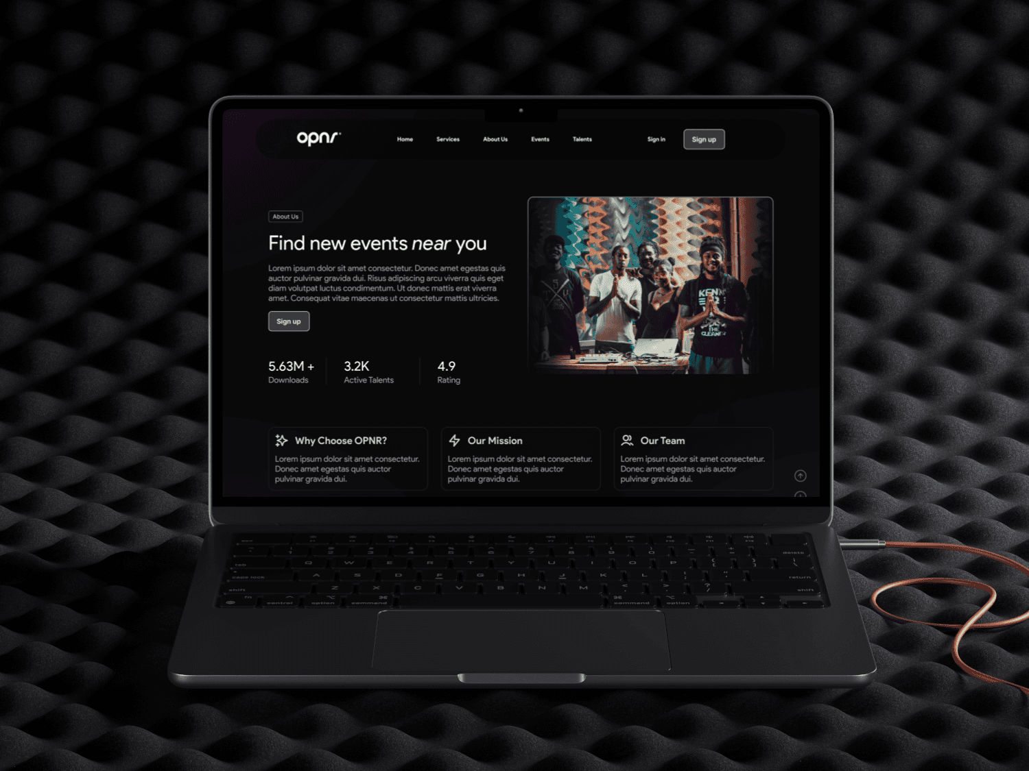
After a monetization strategy secured $25,000 in funding, I redesigned the landing page in 6 weeks so visitors understand the offer within seconds.
The problem
The page spoke only to musicians
OPNR helps emerging musicians win opening slots at live shows. Its landing page didn’t match the company’s goals, didn’t engage visitors and left out event managers and fans.
What I did
I audited, benchmarked and redesigned the page
With business stakeholders, a PM and a front-end developer, I found a third user group in the business data, audited the page against usability heuristics and compared three competitors.
Impact
The offer is clear within seconds
The page now speaks to musicians, event managers and fans. Clear calls to action guide each of them to sign up or explore further.
$25,000
in funding from the monetization strategy
01 · Goals
What we set out to do
- Improve clarity of the offer and user onboarding
- Align the UI with the business growth strategy
- Increase interaction, retention and conversion
02 · Research
Three user groups, not two
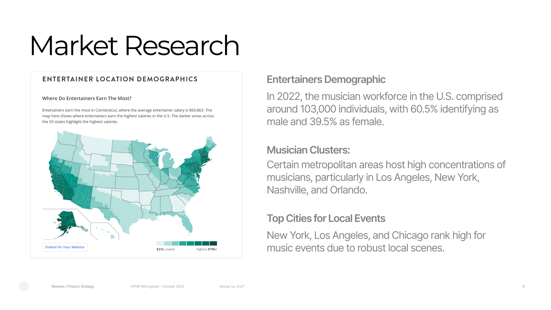
Business data showed three user groups, not the two the client had assumed. That insight sharpened who the page speaks to. Desk research found about 103,000 musicians in the US in 2022, clustered in Los Angeles, New York, Nashville and Orlando, with Chicago ranking high for live events.
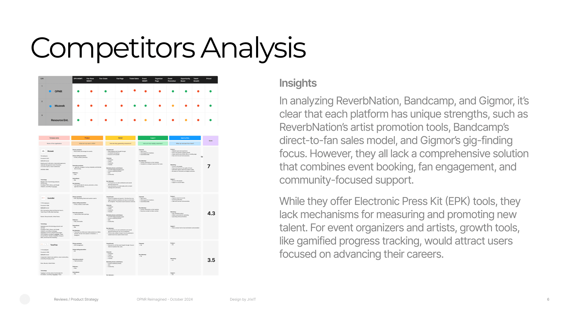
- Competitor analysis: ReverbNation, Bandcamp and Gigmor, compared on value proposition, onboarding, monetization and engagement.
03 · Product audit
Four problems on the original page
I audited the original page against usability heuristics. The findings:
- The hero spoke only to musicians, leaving out event managers and fans.
- Hierarchy, button styles and section headers were inconsistent, so the page felt unpolished.
- Long paragraphs made the page hard to scan.
- The testimonials took almost half the page, with no call to action or clear next step.
04 · Solution
Consistent branding, clear calls to action, clean hierarchy
Low-fidelity wireframes tested layout and flow quickly. High-fidelity design followed, with consistent branding, clear calls to action and a clean hierarchy, so the page communicates OPNR’s value and guides visitors on.
05 · Results
A page that explains OPNR in seconds
Visitors understand what OPNR offers within seconds of landing.
The layout is organized and easier to navigate, with clear calls to action that guide people to sign up or explore further.
The page now speaks to event managers and fans as well as musicians, widening OPNR’s reach.